Sunday, September 27, 2009

Typography

Typography : is the art and technique of arranging type, type design, and modifying type glyphs

Choosing a type a font when creating a publication involves a number of things to take into consideration.
Size?
What type of publication is it?
Brochure, Flyer, Business Card?
Formal vs. Informal
Target Market? Men, Women, Children...?
Color?

  • There are differences in  fonts, which relate to the characteristics of your audience. Legibility and readibility also come into effect when choosing a font.
  • According to an article from Click Business Cards you should choose a font for a business card which relflects your stability and security as well as think about which market you are trying to appeal to. Small fonts are preferred on business cards which are bold since business cards communicate important contact information. Brochure fonts should always be legible. If there is too much going on with the font, the reader will lost interest in reading the information. Also, you should consider the space and images on the page which relate to the font.
  •  For more information on how to chose a good font go to 15 tips to choose good text type.
  • To find free fonts that you can easily download click http://www.dafont.com/
This site is really easy to use. It has hundreds of fonts which are all catergorized so they can be easily found. It also lets you test drive the fonts before actually downloading them.


Wednesday, September 16, 2009

Segmenting Publics

The Minority Advisement Program (MAP), located in the Multicultural Student Center is a great example of segmenting publics. Much like that of a "target market" in marketing. However there is a difference.
Excellence in Public Relations and Communications Management by James E. Grunig explains that the distinctions between publics and markets is important for understanding the nature of publics. Organizations can choose their markets, but publics arise on their own and choose the organization for attention.
The MAP program is directed at minorities on campus. MAP embraces racial and cultural diversity. Though it is not limited to your ethnicity or race. MAP focuses on providing students with a strong foundation to become well rounded and accepting of diversity, not only on Georgia Southern’s campus, but in life.
  • When creating a brochure for this program it would best to insert pictures of diverse students to immediately capture the attention of many different people. The design of the brochure should also reach out to cultures, possibly the use of bold colors or even flags from different countries could be incorporated.
For more information about this topic please visit this website with articles from magazine Public Relations Quarterly Segmenting Publics

Sunday, September 13, 2009

CRAP: Contrast, Repetition, Alignment, Proximity

REPETITION REPITITION REPETITION REPETITION

When it comes to designing any publication whether it be a flyer, brochure, or leaflet, it is important to incorporate Robin Williams 4  design principles: Contrast, Repetition, Alignment, and Proximity. Each of these contribute to an effective publication which intrigues the reader. Though all elements are important, the element of repetition is overlooked for its ability to really capture the attention of your target market.

Repetition: Repeated design throughout interface which creates consistency and unity

Repeating styles throughout the page gives a more cohesive feel to your work, while making it stand out more to the reader. Even the heading of this blog was more likely to get your attention with its repetition. JFK's inaugural speech caught the attention of an entire nation showing how extremely effective his speech was. He used repetition with his sentences, for example beginning four consecutive paragraphs with "Let us". This arrangement of sentences parallels good design principles because re-using symbols or certain lettering on a page is more likely to appear as a better visual compared to a publication with noticible differences. So next time you begin to design something, rememeber the repetition element of CRAP.

An analysis of allCRAP elements by Michael Rundle "CRAP"

Tuesday, September 8, 2009

My "About Me" Page

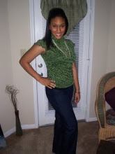
Welcome to Diandre Usssery's Bio!

Thanks http://ow.ly/nLHM for the Bio Tips


I am a senior Public Relations student at Georgia Southern University. Being active and creative are a few of the things that keep my mind energized. I love traveling! Because my parents also love to travel I have been at least one new place every year of my life since I was one years old. However, as a college student this has become more difficult. Music is another passion of mine. Singing, dancing, and even acting. Especially broadway musicals. My favorite was Wicked starring Idina Menzel. SPORTS!!! Though I do not like running, I love to play soccer. Ironic isn't it. I have played soccer since I was 4 and even continued with intramurals in college.


This blog will consist of some of my opinions with what is going on in the world today! (I watch a lot of CNN- but am interested in what other reporters have to say.) Feel free to comment and let me know what you think. Also, I will discuss many useful tips for PR people which could really help you with improving design for fliers, leaflets, or any other creation. You can find me on facebook and I am new to twitter so be patient with me. You can follow me @dussery2.